
Thursday 31 October 2013
Thumbnail 33 - Holy Madness
Thumbnails 24 - 32


Wednesday 30 October 2013
Byzantine Cannibal Character Profile
x Unsuspecting - older gentleman, visible ageing, looks fragile but is far from it.
x Sadistic - loves the pained expressions on his victims faces as he wounds them.
x Widow - wife and child died during child birth.
x Old soldier - trained to kill, learn of his preference for flesh and sadism during his service.
x Sexually abuses victims, chewing at their skin and flesh, stabbing and tearing them to pieces while having intercourse.
x Favourite victims - Prostitutes, homeless girls, young children. Anyone he can gain physical and sexual dominance over easily.
x Keeps victims right eyes - the right side is most dominant for many people, the eyes are windows to the soul, owns a piece of their soul and is his ultimate dominance over them.
Any feedback on how I could improve the profile or flesh the character out even more would be appreciated! Thanks :)
Tuesday 29 October 2013
Cannibal Characteristic Map
This mind map of a cannibal's characteristics is a further look at what possibly makes a cannibal tick. This characteristic map points in a totally different direction to what I was previously looking at and makes some of the ideas in previous thumbnails ( eg. pentacles, satanic representations, devil worship, etc.) feel extremely generic. Although this is extremely helpful as it means I can avoid a potentially dangerous avenue early on, the previous 6 thumbnails however serve as a building block.


Thumbnails 1-6
This is my first set of thumbnails for the Byzantine Cannibal. I really like 1 but am unsure if it really feels like my character. I was really unsure about how the room should be shaped so there are some generic layouts, to try some different I tried to suggest a hexagon/pentagon with 3 and 5 but I am Extremely open to suggestions and advice!

Project Two: The Secret Lair of the Byzantine Cannibal Research Maps
The character I got for my Secret Lairs project is the Byzantine Cannibal. This particular character plays to my strengths slightly as I am both familiar with the Byzantium Empire and Cannibalism as far as a basic understanding, I am, however, surprised greatly with the research into both key words.


Thursday 24 October 2013
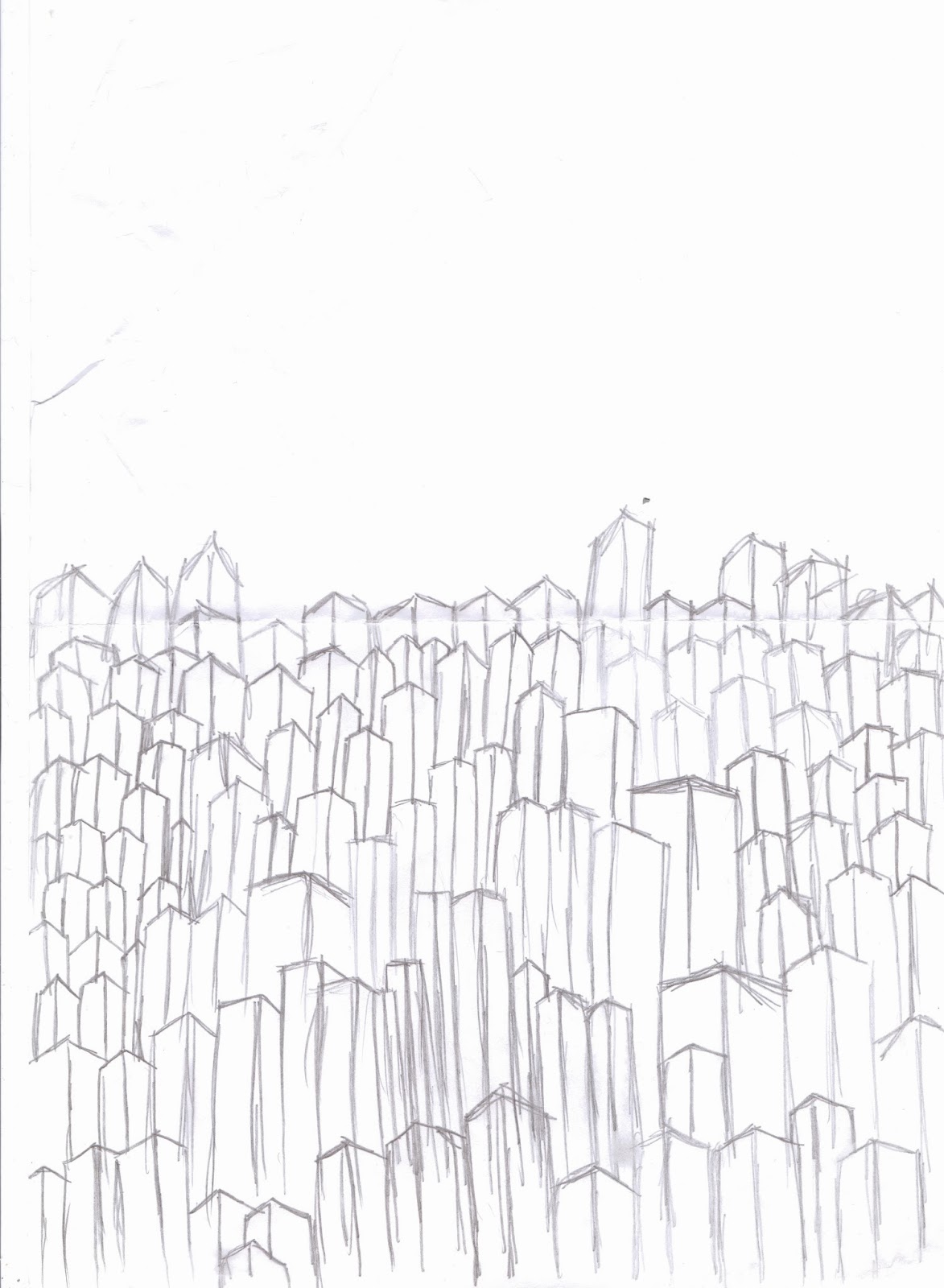
City Final Concept Piece

Musician's Crowd Final Concept Piece
This is my final concept piece for Metropole's crowd scene. The large amount of colour used in this piece for both characters and the air around them symbolically represent the flow of emotion, the musician in the centre is bright red and orange to emphasise him as a focal point of the scene. The crowd is all draw manually because this gave the effect I intended for the scene, I experimented with a custom brush but found this didn't add to the effect and instead only served to confuse my audience and male the scene unreadable.


Tuesday 22 October 2013
Graveyard Final Concept Piece


Thumbnail 97
I really like this thumbnail, the composition maybe basic but I like how the black tower stands aloft a hill that plays host to a mass grave site just stirs that uncomfortable feeling.


Monday 21 October 2013
2001: Space Odyssey Review
 |
| Fig 1: 2001 Space Odyssey Poster |
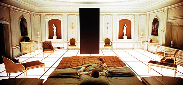
The film "2001 A Space Odyssey" is a extremely abstract film with little in the way of a solid storyline. Directed by Stanley Kubrick and Arthur Clarke, the author whose book the film was adapted from, the film takes a profound approach in its debating of philosophical ideas and arguments, the first of these being the birth of humanity. The birth of humanity is torn between religious and scientific origins, both having valid points and affirming their own theories but it is obvious from the beginning of the film that Kubrick opted for the scientific theory, this being Darwin's theory of evolution, and takes the audience on a journey through the first part of the film as he explores and portrays the moment our ancestors took tools into their hands and used them for violence. "Stanley Kubrick's 2001: A Space Odyssey is one of the greatest films of all time and it is the director's most profound and confounding exploration of humanity's relationship to technology, violence, sexuality and social structures." (Caldwell 2011) This statement by Caldwell highlights the way in which Kubrick ties the core or, as he portrays, primal aspects of humanity into our advancement from ape-like creatures into something more sophisticated. In the scene mentioned before,he creates a moment where both primal aggression and human ingenuity are combined into our species first steps in technological development. The beauty of this scene is awe inspiring as Kubrick's imagination captures the emotion and brutality of the scene perfectly, when on ape strikes another and kills it can be interpreted as the destruction of the primal self, the door way to the future opened by a single act of both intelligence and violence.

Fig 2: Ape monolith scene
That moment in 2001:A Space Odyssey was marked by the appearance of a black monolith, an imposing and frightening looking slab that acts as a prompt for the advancement of man or simply as a marker for the moment of that advancement. The film then skips millions of years ahead to a time where humanity has mastered space travel, with shuttles taking people from earth to the moon like aeroplanes of the modern day ferry people around the world. This brief look at humanities advancements serve only to excite the audience at the prospect such wonders, with Kubrick's sets and special effects making the scene incredibly believable to even a modern audience. It appears that man has mastered the space travel, conquering that have been above our heads and beyond our reach for a millennium. This is played down though by the dicovery of an artefact buried on the moon, the audience is kept i suspense about just what the object is until they are actually shown it and it is in this special but horrifying moment that the audience lays eyes on the familiar shape of a black monolith. "The plot is not so much of structure but rather of events or moments in time that are united by the appearance of a large black monolith." (Haflidason 2001) This quotation perfectly represents the audience's realisation, as well as the now outlandish thought to which Kubrick provides a completely creative but insane scenario for because if the monoliths really do mark the advancements of humanity, where is there to go beyond the stars?

Fig 3: Final monolith scene
Kubrick's answer to this question comes with the overwhelming special effects and a bright white room. A mission to Jupiter is launched and with several men in cryogenic pods and a super computer by the name of HAL 9000 to investigate an anomaly, but with an error from the super computer the entire voyage becomes litter with the deaths of the crew members as the computer goes about systematically killing them off, setting the standard for evil super computers in all forms of fiction (an example of this would be GLaDOS). "The final sequence of 2001 is speculation through imagination, positing a new Xanadu, a world of wonders where time and space no longer exist, just as the rest of the film speculates on various levels, exploring the new vistas opened up by the encroaching space era" ( The Observer 1968) The remaining crew member is transported to Kubricks answer, where time and space is irrelevant and everything is neither past, present or future. This "new Xanadu" is the accumilation of everything and is both a profound philosophical answer to the questions that desperately what answering, for both past and present audiences.
List of Illustrations:
Fig 1: 2001: A Space Odyssey poster (1968) At: http://inktank.fi/17-little-know-facts-about-2001-a-space-odyssey/
Fig 2: Ape monolith scene from 2001: A Space Odyssey
Directed by Stanley Kubrick, At: http://onlyhdwallpapers.com/space/movies-2001-a-space-odyssey-desktop-hd-wallpaper-240678/
Fig 3: Final monolith scene from 2001: A Space Odyssey
Directed by Stanley Kubrick, At: http://www.collativelearning.com/PICS%20FOR%20WEBSITE/stills%202/2001_a_space_odyssey_movie_image__3_.jpg
Bibliography:
Caldwell, Thomas (2011) http://www.rottentomatoes.com/m/1000085-2001_a_space_odyssey/ (Online Review) Accessed 21/10/13
Haflidason, Almar (2001) http://www.bbc.co.uk/films/2000/09/18/2001_review.shtml (Online Review) Accessed 21/10/13
The Observer Newspaper (1968) http://www.theguardian.com/film/2010/oct/21/space-odyssey-review-science-fiction (Archived Newspaper Review) Accessed 21/10/13
King Kong Review
 |
| Fig 1: King Kong Poster |
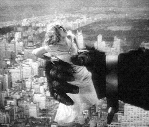
The film King Kong is a extremely iconic film, with several adaptations each trying to capture the classic story of a damsel in distress. The original film (1933) was produced and directed by Merian Cooper and Ernest Schoedsack and is a landmark if film history. The film's plot is generic, a damsel in distress needs rescuing from some evil force by the valiant white knight, but beyond that outline is where the plot begins to change into something that has captivated audiences for decades. The damsel, Ann Darrow, is whisked away by the film producer Carl Denham who plans to voyage to a uncharted island for his next movie only for Ann to be kidnapped by the giant ape, Kong. "The story, like "Frankenstein" and "Dracula," has taken on the significance of a modern folk tale, layered with obvious moralizing and as familiar as personal history." (Smith 1991) The unique story of King Kong has left its mark in history and filmic practices, being remade several times with each new version attempting to recreate the success of the original and reinvigorate a story that has become, as Smith puts it, modern folk tale in its own right.

Fig 2: Kong Attacking a plane scene
The film is full of topics, stereotyping, race, class and sexism being among the most prominent and obtuse. The attitude towards race in King King can be classed as appalling, the faked Chinese accent, the multitude of black actors used for the islanders and Carl Denham's line about the team with him being the first whites to set foot there all have a poor taste in any audiences mouth, "...viewers will shift uneasily in their seats during the stereotyping of the islanders in a scene where a bride is to be sacrificed to Kong..." (Ebert 2002) with a reaction just like the one Ebert describes a familiar feeling to those who have viewed the film. Although the film does border on the outright offensive, it does not diminish the spectacle granted to us, "...from the moment Kong appears on the screen the movie essentially never stops for breath." (Ebert 2002) with the films special effects so awe inspiring for the time period and really bringing the spaces to life, even for a modern audience, and the amount of creativity and entrancing visuals playing with the audiences imaginations like putty.
The portrayal of women in the film is poor, with Ann Darrow being a completely passive character to the events around her and being pulled about in the story's flow. This stereotypical view of women may have been accurate for its time period (1930s) but only when in the environment of 'civilised' society, as a human's base instinct to survive and by any means possible is identical regardless of sex. The way in which Ann has been portrayed may have been to frustrate women watching the film, showing a reflection of the 1930 female stereotype so flatly to them as provocation. "An icon of pop culture with truly erotic and emotionally touching scenes between Fay Wray and the massive gorrilla" (Levy 2011) The scenes in which Levy speaks of are at best elusive, with Ann, played by actor Fay Wray, screaming at the top of her lungs throughout many of the scenes with Kong in primal fear of him, leaving very little or no room for interaction between the two beyond her being held like a toy in his hand. The elusive nature of these scenes brings the audiences feelings of sympathy to lay solely on Ann by the end of the film with her traumatic ordeal over and Kong dead.

Fig 3: Kong holding Ann scene
List of Illustrations:
Fig 1: King Kong Poster (1933) At: http://www.best-horror-movies.com/image-files/king-kong-1933-poster.jpg
Fig 2: Kong attacking a plane scene from King Kong (1933)
Directed by Merian Cooper and Ernest Schoedsack, At: http://upload.wikimedia.org/wikipedia/en/8/88/Img_kingkong1.jpg
Fig 3: Kong holding Ann scene from King Kong (1933)
Directed by Merian Cooper and Ernest Schoedsack, At: https://blogger.googleusercontent.com/img/b/R29vZ2xl/AVvXsEhq46_LmRysg3dJ9URz1vhycuoJ5HUWg2ZeNd9n9FT-y6GL0-YT0sju4flpF_wH29fLfocAHXJHGn3mL_-YYxwGmksg_OK8OmxfqfYsh7tnCpclnzsvFHX_dmCnXmdwOVSAkkyQLe9sFrQ/s1600/KINGKONGfay-wray.jpg
Bibliography:
Ebert, Roger (2002) http://www.rogerebert.com/reviews/great-movie-king-kong-1933 (Online Review) Accessed 21/10/13
Smith, Mark Chalon (1991) http://articles.latimes.com/1991-10-24/news/ol-253_1_king-kong (Online Review) Accessed 21/10/13
Levy, Emanuel (2011) http://www.rottentomatoes.com/m/1011615-king_kong/ (Online Review) Accessed 21/10/13
The Cabinet of Dr Caligari Review
 |
| Fig 1: "The Cabinet of Dr Caligari" Poster |
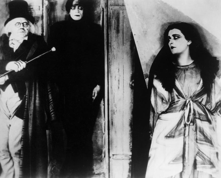
"The Cabinet of Dr Caligari" is a 1920 German silent movie directed by Robert Wiene and is considered one of the greatest silent horror films created. The plot of "The Cabinet of Dr Caligari" revolves squarely around two of the main characters in the film, the first being Francis who is the protagonist of the tale and the second is Dr Caligari who appears to be the antagonist. The design of these characters is interesting in itself as Dr Caligari is portrayed as a absolute fiend, secretly murdering whoever he wishes with the sleepwalker/somnambulist Casare, slithering around the films environments and fooling everyone with his 'act' as the head doctor of an asylum. This contrasts greatly with the characteristics of the lead protagonist who is portrayed as having a strong sense of justice, smarter than the authorities and a shrewd detective as he figures out Dr Caligari's real identity. These two designs are so simplistic in their portrayal of their respective characters that it can even appear as if the film is a child's book with the battle between a hero and a villain that contrast each other completely and show no blurring to whether they are good or evil. "None of them can quite be believed, nor can they believe one another." (Ebert 2009) The way Ebert describes Wiene's characters could not be more apt, the design is so simplistic and flat, with little beyond their exterior shell that could be considered a personality but this is done purposefully so as to encourage them to be unbelievable to the audience.

Fig 2: Rooftop chase scene
The set design of the film mirrors this theme of the unbelievable with its quirky layout and architecture that takes heavy influence from German expressionism as a way of portraying the twisted and warped emotional state of the protagonist and his unstable mentality. The way Wiene has faithfully reproduced the artists vision lends aid to the unbelievable factor of the films main plot and characters, as they glide through their unnatural landscape completely accustomed by its warped shape. "Robert Wiene has made perfect use of settings designed by Hermann Warm, Walter Reimann and Walter Roehrig, settings that squeeze and turn and adjust the eye and through the eye the mentality." (Variety Staff 2006) This quotation above highlights specifically how the quirky sets twist and change the audiences viewing of film considerably and are used specifically to do so. The sets may have been cheaper to use then their realistic counterparts, but as the ending twist to the film suggests, they set the tone, mood for this surprise ending to really explain the purpose and meaning behind the use of such sets.

Fig 3: Jane visits Dr Caligari's Tent
The scene shown above is the scene when the female lead, Jane, visits Dr Caligari's tent in search of Francis and her father. This is a eerie and frightening scene within the film as Wiene stretches out the encounter and Cesare's awakening to build a sense of agonising suspense, which is only heightened by Jane's flailing and overly dramatic reactions. "The narrative frame creates ambiguities that hold certain elements of the story in disturbing suspension" (Rosenbaum 2007) The pure fact that the film is silent is what allows this painful suspense and fright to grow and develop as the audience must watch both murder and kidnapping take place without a sound, the frightening horror as the other characters rush to aid the assailed individual but, despite their visual desperation and emotional state, they cannot help and they themselves must watch with the audience Dr Caligari scheming and Cesare's murderous streak grow while powerless to stop it, and it is this sense of powerlessness that captures the audiences breathes, from 1920 to now, again and again.
List of Illustrations:
Fig 1: "The Cabinet of Dr Caligari" poster (1920) At:http://verdoux.files.wordpress.com/2008/04/the-cabinet-of-dr-caligari.jpg
Fig 2: Rooftop chase scene from The Cabinet of Dr Caligari (1920)
Directed by Robert Wiene, At: http://quietus_production.s3.amazonaws.com/images/articles/1003/caligari_1232121486_crop_550x441.jpeg
Fig 3: Jane Visits Dr Caligari's Tent scene from The Cabinet of Dr Caligari (1920)
Directed by Robert Wiene, At: http://images.fineartamerica.com/images-medium-large/the-cabinet-of-drcaligari-granger.jpg
Bibliography:
Ebert, Roger (2009) http://www.rogerebert.com/reviews/great-movie-the-cabinet-of-dr-caligari-1920 (Online Review) Accessed 21/10/13
Variety Staff (2006) http://www.rottentomatoes.com/m/1003361-cabinet_of_dr_caligari/ (Online Review) Accessed 21/10/13
Rosenbaum, Jonathan (2007) http://www.chicagoreader.com/chicago/the-cabinet-of-dr-caligari/Film?oid=1068606 (Online Review) Accessed 21/10/13
Thumbnail 94
This idea is a combination of my endless building skylines and the previous illusion tunnel ideas. Thanks to Simon for prompting it ;)


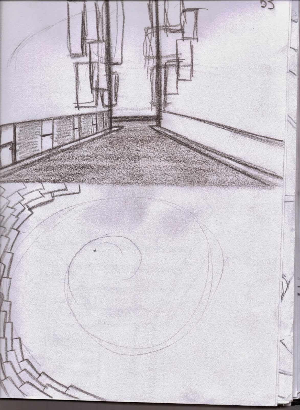
Thumbnail 92
This thumbnail takes influence from 2001: Space Odyssey's monolith, using the objects imposing shape to signify the religious building in the scene.


Sunday 20 October 2013
Thumbnail 91
This is a clean drawn City Lights idea, I really like this concept as it reminiscent of Metropolis' poster artwork and portrays the city as neverending skyscrapers.

Thumbnail 90
This thumbnail was in response to what Jordan went through with me on Friday and my own version of the massive graveyard. I'm not 100% pleased with it but I like the direction it is moving in.


Thumbnail 89
This thumbnail is one of the graveyard scene and was an example from Jordan about how I should structure composition and using a rough brush to block out the details of my idea quickly to determine whether it works or not. I added slight detailing to this piece to solidify the idea in my mind and I am really inspired by it to further push my pieces. Although the final crit is on the Friday, I feel absolutely confident I will complete the required work to the best of my ability and be able to show the development and finalisation of my ideas with pride in my work.


Thumbnail 88 Colour Composition
This thumbnail is a colour rendition of the thumbnail 79. The composition is balanced and i make use of depth but I think it has an element of being too overloaded with colour and/or detail, losing the impact I try to achieve.


Thumbnails 86 & 87
These two thumbnails are two separate looks at how this single composition can be done with slight tweaks to both. The first looks and using perspective lines to construct the scene as accurately as possible while using previously explored building design for the foreground buildings.
The second design uses a different method where I roughly drew out what I wanted the city to look like in a large black brush and then defined each building and the skyline using the rubber, with the negative space as my line work and showing depth with the grey tones in the background. The high contrast works well I think and gives the composition a totally different feeling.
 |
| 86 |
The second design uses a different method where I roughly drew out what I wanted the city to look like in a large black brush and then defined each building and the skyline using the rubber, with the negative space as my line work and showing depth with the grey tones in the background. The high contrast works well I think and gives the composition a totally different feeling.
 |
| 87 |
Thumbnail 85
Attempting to combine several ideas together on this one, but found that I overloaded the canvas instead. As well as losing the impact of the corner building by hiding the top and bottom points the rest of the composition reads terribly and looks untidy and forced.


Thumbnail 84
This thumbnail was a back to basic idea for my cityscape, although a step backwards from previous developments it allowed me re-draw a starting line for future designs.


Thumbnail 83 Colour Composition

Thumbnail 82 with Colour Composition
This thumbnail is an attempt at combining 55 & 56's traits into a single image. I've used slightly more curved lines for the buildings and used another thumbnail idea for the background. I think it works well, but not well enough for my final ideas. The colour composition for this piece brings the scene to life more, with the blue and orange/yellow being a complementary colour scheme. I was attempting to show how a city's energy is inside its buildings at night, with the buildings different shades of blue and the windows a bright orange to show energy.


Post-Greenlight Thumbnails 54 - 81
 |
| 53 & 54 |
 |
| 55 |
 |
| 56 |
Thumbnails 55 & 56 where two defining ideas within the cityscapes development as each lent a different feeling to the space. I feel 56 really brought the space to life with its disorderly and distorted buildings and jumped feet first into expressionism, where as 55 remained orderly and too structured, removing all emotion from the foreground and middle ground and conflicting with the mismatched background.
 |
| 57 |
 |
| 58 |
 |
| 59 |
 |
| 60 |
 |
| 61 |
 |
| 62 |
 |
| 63 |
 |
| 64 |
 |
| Top Left: 65 Middle Left: 66 Bottom Middle: 67 |
 |
| 68 |

 |
| 81 |
Subscribe to:
Posts (Atom)